
FinaFlex
2024
stimul8 redesign
VIEW PROCESS BELOW
The client expressed dissatisfaction with the current label designs for this project, feeling they didn't align with their desired more hardcore/grunge style and, requested my input on revamping the labels. Initially, I updated the colors to create more cohesion with each flavor, enhancing the product shelf diversity and making them more distinctive within the FinaFlex brand. I then focused on making the flavor logo more prominent by significantly increasing its size and giving it a sharper and more unique look. Adding textures helped eliminate the some of the “softness” of the current labels.
Next, I revamped the face of the label by stylizing the call out word "REVAMPED" and adding lightning effects to the product name. The most significant change I proposed was creating a window on the front of the label using the main logo, allowing customers to easily see the product and encouraging repeat purchases. In my opinion, the revamped label brings a much-needed touch of attitude and style that the existing label is missing.
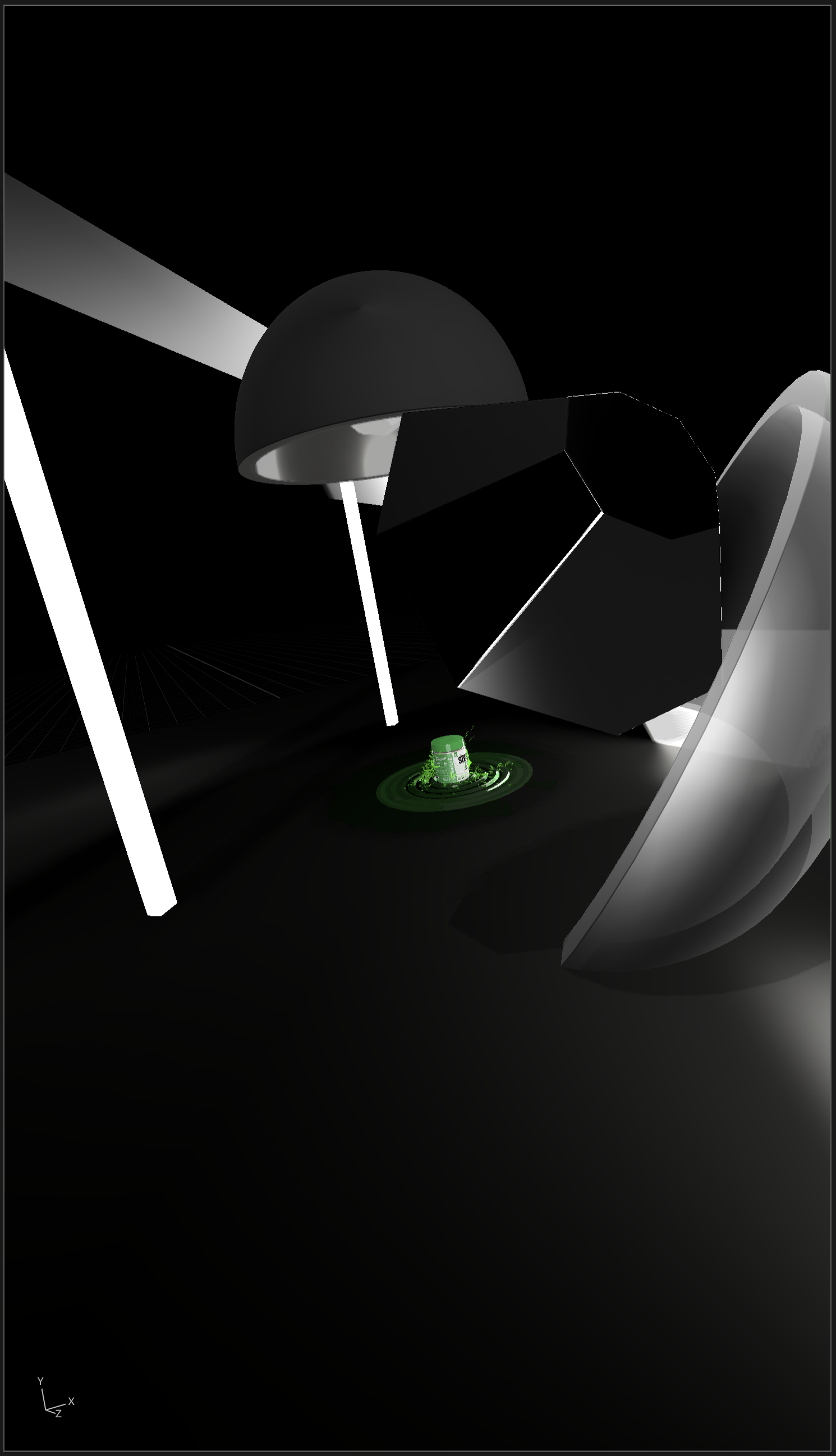
3D SET UP

RAW 3D

BASE RENDER

FINAL COMPOSITE